Several weeks prior to the end of the 2022 election cycle, Voter Science produced a set of general election predictions for legislative district candidates. Using a combination of demographic factors and expected voter turnout, we produced these predictions at the individual candidate level using regression based statistical modeling techniques. These predictions were shared with a small circle of trusted stakeholders prior to the general election, and we delayed releasing them to a larger audience to avoid an undue influence on legislative contests.
On the afternoon of the general election, we released our predictions to the general public. Our original predictions can be accessed by clicking here: 2022 Legislative Race Predictions
Post election, we compared our predictions with candidate level performance. On average, our predictions tended to be highly accurate: the mean prediction error (or MAE) was only 2.5%. Of the 94 races assessed, we were able accurately predict the outcomes of 97% of the time.
Our ability to accurately predict races ahead of time has several applications including resource allocation across multiple races as well as assessing the viability of different candidates to run for office. We will cover potential applications of this ability in a future blog post.
For those who didn’t see the demo at Roanoke 2023 or have enrolled as beta testers, it’s my pleasure to introduce you to the v2.0 release of Voter Science Canvasser on Android and iOS. The three major new features included in this release are:
New dashboard panel
New route detail panel
Optimal route generation
Most of these new features have been suggested by users in the field, and I want to thank everyone for providing that valuable feedback during the 2022 campaign season. As a candidate I was also testing the designs first hand, a tradition that at Microsoft we referred to as “eating our own dogfood.”
New Dashboard Panel
Probably the most obvious change that you’ll notice on first launch of the 2.0 release is the new DASH tab on the main screen. This will be familiar if you’ve used VS Fundraiser, and it’s basically loaded with statistics and history for the selected walking list.
Like Fundraiser, the dashboard consists of two animated donut charts that summarize the status of households in the current sheet (To Do, Voted, Complete, etc.) and the result of contact for each that have been visited (Left Literature, Talked with Voter, etc.). The History section contains a list of all the doorbelling sessions for the sheet, broken down by date and by canvasser email. In the detail line for each history entry, you’ll see the number of households canvassed during that session, the total number of voters represented by those households, and the total distance covered.
Tapping any of the history entries will show the new route detail panel:
Route Detail Panel
This detail panel roughly shows the path taken canvassing during that session. Since we’re just connecting the positions that were logged in the history by GPS position and timestamp, it’s not necessarily your actual walking path but an approximation. That said, it can quickly identify volunteers who may have tried to canvass their walking list from the local Starbucks. Note that the pins on this path currently represent voters visited, and not households, since that’s how changes are logged. A future update may consolidate those back into households so that you can tap them to navigate to the household detail panel.
Optimal Route Generation
You will notice a new option in Settings > Lists> Sort By:
By selecting the new Route option, Canvasser will generate an optimal route for you to take to canvass the walking list. Creating optimal routes is a generalization of the Travelling Salesman Problem (TSP), which belongs to the class of NP-complete problems. Thus, it is possible that the worst-case running time for any algorithm for the TSP increases superpolynomially (but no more than exponentially) with the number of potential stops, making it impractical to simply brute force. The algorithm that I’ve chosen is a classic pairwise exchange or “2-opt” technique constrained by paths segmented by block and side of the street (thus preventing zig-zag patterns as you progress down the street). This ends up being a decent optimization for canvassing, given that we currently can’t easily constrain to actual street geography.
Here’s an example shown on the Hybrid map type:
The optimal route is shown with red traces, just like the historical routes shown in the new route detail panel. The List tab is also sorted in the optimal route order, allowing you to just swipe through household detail view to progress through the walking list.
Getting Started
The v2.0 release of VS Canvasser represents a major feature release for the 2023 campaign season, and it is now live on both the Google Play Store and Apple App Stores.
We remain committed to further tactical improvements as the election cycle progresses. If you have any additional feature requests, please send them to chad@voter-science.com and I’ll make every effort to roll them into a future release.
In light of the Senate passing SB 5082 to end advisory votes, I thought I’d highlight a personal project that shows their value even if they aren’t legally binding. Specifically, I wanted to make it easy for voters to determine how often their representatives in Olympia match their district on legislation that is referred to the ballot.
It’s codenamed Project Fidelity, and you can access it from my WhipStat site here:
To create this I researched the LD breakdowns of all ballot measures since Initiative 960 went into effect in 2012. Some of these were already posted on the WA Secretary of State website, but several years were missing and needed to be obtained via public records request. I then compared them to voting records for all members using Legislative Web Services, something that I’d already been leveraging for the Partisan Leaderboard and Identify Friend or Foe projects.
To use this tool, simply select the chamber and date range that interest you and a stacked scatter chart will be displayed on the left showing individual member fidelity scores, with 0% meaning that they never matched their district, and 100% meaning that they were always consistent with the majority of their constituents. The data points (with tooltips) are color coded by party and you’ll also see vertical lines that represent the median score for each party. Clicking an individual member in the chart will show a table below breaking down every bill that went before voters during their tenure, their last floor vote on the bill, the percentage of their constituents that supported it, and whether they matched.
If you click the Download button, it will create a tab-delimited file for each member on the chart and their score, allowing you to create an easy leaderboard in Excel for the best and worst members at voting their district. (It’s also worth noting that the Republicans median score is 60%, compared to 50% for Democrats. That might help explain why they seem so invested in ending advisory votes.) One thing that surprised me is that members from swing districts aren’t very good at representing the majority of their constituents. For example, I only got 50% of them right and I still had the best score of anyone representing the 5th LD.
We at Voter Science hope that Project Fidelity can provide a little more transparency into our state government, allowing WA taxpayers to easily determine which state legislators are voting with their district on legislation referred to the ballot, and which might be selling out to special interests or simply voting party line. It’s an opportunity to hold them more accountable for their voting record when they’re up for reelection, using a mechanism that was created with Initiative 960 and may soon be disappearing.
The two most important metrics used to assess a campaign are doors and dollars. Your canvassing efforts prove your work ethic and ability to connect with voters face-to-face, and successful fundraising efforts reflect your support in the community and ultimately determine whether you’ll have the resources to run a formidable campaign. For most of our history at Voter Science, our ground game has been focused on Canvasser (codenamed TRC), a mobile app that helps you be more effective at the door, but today I’d like to introduce you to our new Fundraiser app (TRF).
You can download Fundraiser from the Apple Store or Google Play Store here:
At a high level, Fundraiser’s goals are simple:
Organize and target your fundraising lists
Integrate with latest public data for lobbyists and historical donors
Automatically provision and scale to any elected office
Expertly manage call logs from your smartphone
Here’s a quick slideshow of the app:
Usage
Like Canvasser, you can download Fundraiser from the app store for free and sign in without registering for an account or paying any subscription fee. All you need to do is provide an email address for us to send a PIN to verify your identity. Unlike Canvasser, however, you can create new call sheets immediately from within the mobile app by selecting New Sheet from the menu. Simply select the jurisdiction (local, legislative, judicial or statewide), office and district for your campaign from the drop-down lists and give your new call sheet a name. When you hit the Create button, a call sheet will be available within seconds based on historical donations to that district. Large lists will automatically be broken up into subdirectories to optimize for performance and reduce the footprint on your device.
Instead of creating a new call sheet from scratch, you may simply clone one of the examples like the GOP Lobby List. Any new call sheets that you create, clone or have shared with you will appear with a filled flag in the menu and allow write access to the call log, which is summarized on the Dashboard tab. The List tab shows the call prospects, sorted in the order you’ve selected in Settings. Prospects in the list are also color coded by propensity, which is based on the ratio that they’ve contributed to your party compared to others. Green prospects, contacts and organizations indicate they they’re likely friendly, whereas red ones might be less inclined to contribute.
While donors have been matched to public databases as well as paid lists of over 5 million records that include phone numbers and email addresses, lobbyist information is even more tightly integrated with public records from the PDC’s Open Data initiative. This not only includes names, addresses, phone numbers and email addresses, but also profile photos, bios, and up-to-date client lists. Contribution records from the PDC are also matched using our proprietary fuzzy matching algorithm against Voter Registration Database records going back to 2008 and the latest Corporations and Charities Filing System from the Secretary of State.
Finally, there’s a statewide Search feature built into the application that will allow you quickly review campaign contributions of any individual donor. This feature was added by popular request and is especially useful during filing week to determine just how partisan new candidates running for non-partisan positions really are.
Video Tutorial
The following video tutorial should help you get familiar with using Fundraiser:
Pricing
The mobile app itself and access to all public data is absolutely free. A subscription charge of just $100 per calendar year is required for access to paid phone numbers and email addresses. Currently, about half of donors in TRF include paid contact information, and with your support we’ll be purchasing additional lists to make that coverage more complete. In-app purchases will be enabled to subscribe directly from your phone soon, but until then please just contact us at info@voter-science.com for more information.
Given how often what’s said on the campaign trail bears so little resemblance to votes cast on the House or Senate floor, it’s become a full-time job holding our elected officials accountable. Stakeholder groups will spend hundreds of hours tracking bills and legislative voting records to generate candidate ratings every year, and some even pay professional lobbyists to provide those services. To what end? Simply to help identify friend or foe.
Voter Science has provided tools in the past to track bills of interest through the legislature, but we’ve found that the data entry required to tag bills that an organization supports or opposes can be a significant barrier to entry. Folks simply don’t have the time to maintain these lists because they’re too busy trying to work the halls of the state capitol and advocate for their positions with members one-on-one and in committee hearings. Fortunately, since 2014 we’ve had an online committee sign-in system for public hearings that’s a public record of positions that individuals and organizations have taken in support or opposition to every bill that’s been granted a hearing. In fact, at the beginning of the 2022 legislative session there were exactly 322,706 records from such public testimony. With this public data, we already know which bills that stakeholder groups have decided to support or oppose, so there’s really no need for any tedious data entry. Moreover, our state’s Legislative Web Services provide the public easy access to member voting records, so we can now automate the entire process of determining how those voting records correlate to each organization’s public policy position.
The user interface is quite similar to my Partisan Leaderboard page, where I display a stack chart for all members by chamber and date range. However, here the main Organization drop-down lists over 1,500 lobbyist employers registered by the PDC that were referenced from hearing testimony records. When you select an organization, an aggregated list of “bills of interest” will be displayed beneath the chart. This table includes the bill number, title, total number of references from the selected organization, number willing to testify, and the percentage supporting the bill, with “Pro” counting as 1, “Con” as -1, and “Other as 0. Note that I’m using a fuzzy matching algorithm to match the organization name entered in committee sign-in to the official PDC records, so they may not be perfect…but we’re getting better every day. Use this list as a quick sanity check to ensure that your organization’s testimony records have been aggregated accurately.
The horizontal axis of the stack chart show shows the correlation between member voting records and organization position for each bill. Members who always vote the organization’s position will have 100% correlation and those who always take the opposite position will have -100% correlation. The dots for each member are color coded by party and if you hover over each you’ll see a tooltip with each members information and their actual correlation coefficient. To save a tab-delimited “leader list” of the member scores that can be imported into Excel, you can simply press the Download button.
Note that I’m currently collecting additional information that could potentially be used to further weight these scores (but that would make them less than a true Pearson correlation). Here are some examples:
A stakeholder’s willingness to testify or whether they’ve travelled from out of town
Committee votes made by members when advancing the bill to the floor
Committee leadership that could be positioned to advance or kill the bill
IFF is obviously a work in progress and we would welcome any feedback you have on our current user interface or algorithms. Since committee sign-in data now must be obtained by formal public records request, our plan is to update this tool at the end of every session, but if more frequent updates would be valuable to legislative advocacy groups we should encourage the Legislative Service Center (a.k.a. LegTech team) to incorporate the sign-in data into the Legislative Web Services, where it probably belongs.
We at Voter Science hope that IFF can usher in a new era of transparency for state government, freeing stakeholders and lobbyists from the tedious process of generating their own candidate rating systems and holding elected officials more accountable for their actual voting records when they inevitably come asking for campaign donations. It may seem obvious, but up until now it’s been surprisingly difficult to know who your friends in Olympia really are.
Votes in Washington State’s primary earlier this week are still being counted, but here are some results so far [as of 8/6/2020]. Data here is publicly available from the Secretary of State.
There was a competitive field of GOP candidates running against a 2-term incumbent Democrat. Here were the results of the top vote getters. The top 2 (Inslee and Culp) will go on to the general.
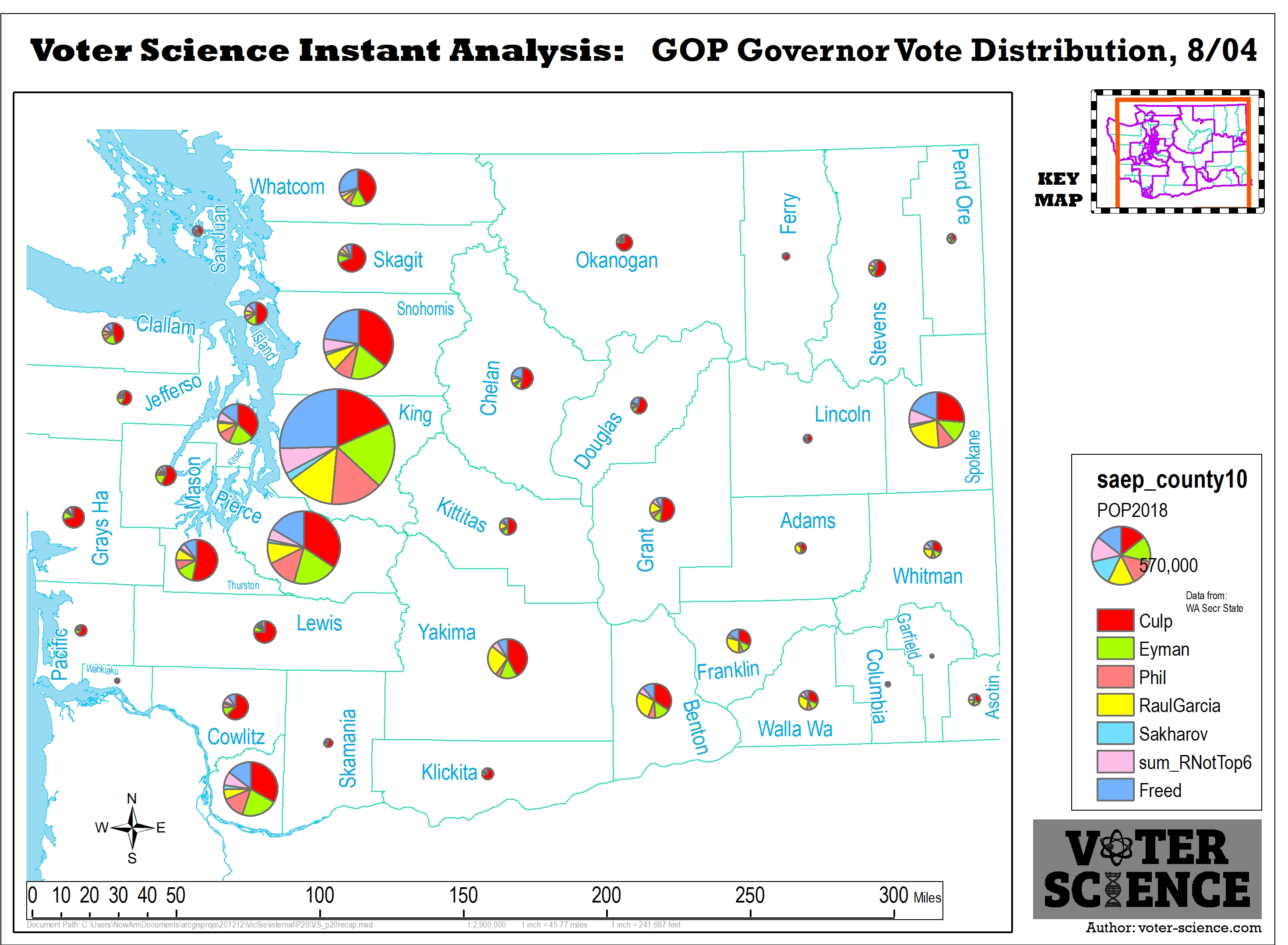
Here’s is a further breakdown of GOP candidates per county. Circle size is weighted per county population.
Here’s the combined Democrat (Blue) vs. Combined Republican (Red).
Who are the most and least “partisan” candidates for WA statewide office?
Often, these sorts of conclusions are argued subjectively in opinion articles based on a candidate’s issue-positions and their endorsements. However, we wanted to ignore the opinions and go straight to the data to draw the conclusions. We used only official public data and all results here are repeatable and could be independently confirmed by following the process we detail below.
This article is a technical case-study for how Voter-Science’s services handled a high-traffic event: the Minnesota GOP State Convention on May 30th. The MNGOP was clear that it was absolutely critical for the site to keep up with the surge in traffic and stay fully responsive during their event. The event was successful. There were surge periods hitting over 1000 requests/second to our servers, and the servers averaged responses in under 100ms.
Here were the engineering steps we took to provide the MNGOP that guarantee…